I designed a website with a classmate earlier in my design career for my Intro to Web Design class; we were given a task to create a company and its branding, as well as its website. We were given different categories to choose, and I chose Charity/Donation website. I wasn’t as exposed to UX practices as I am now. I wanted to go back into this project and redesign and update it, reflecting on bad UX practices that were implanted and seeing what can be improved upon. I believe self reflection is important as well as gauging your skillsets.
The goal was to inform with empathy and motivate others to contribute to the cause.
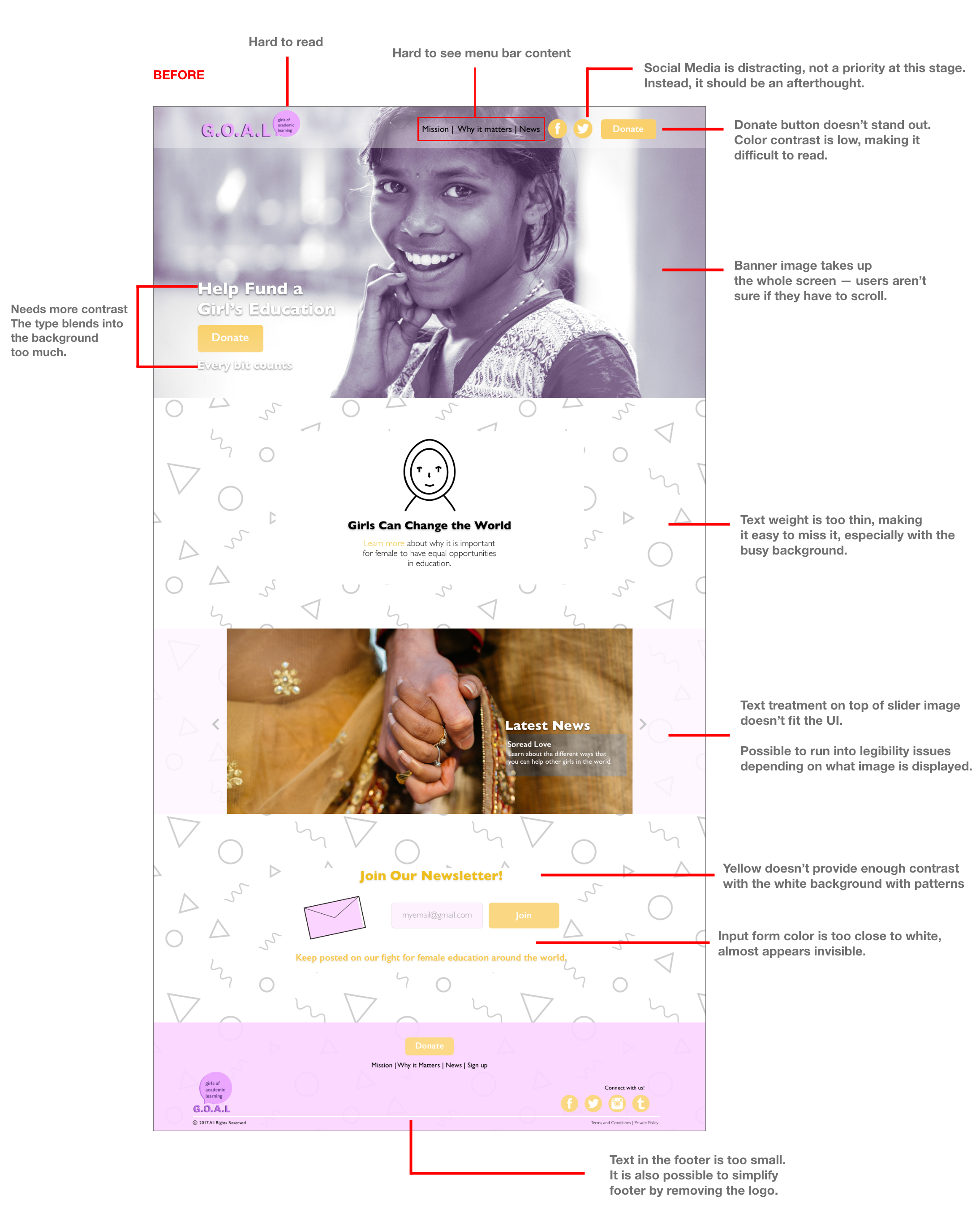
a. Color Contrast
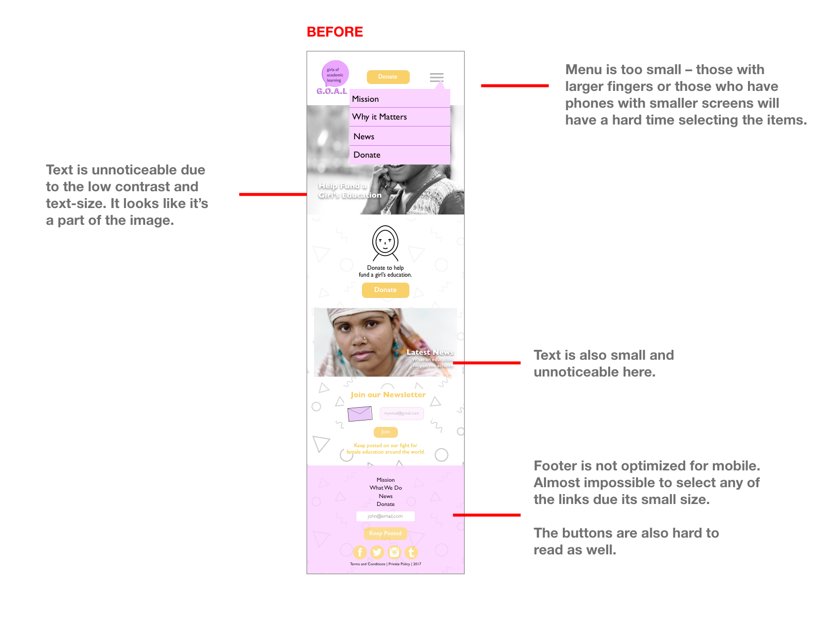
There isn’t enough. It is hard to see some of the text, especially with a background that doesn’t serve as a strong contrast.
b. Type size and weight
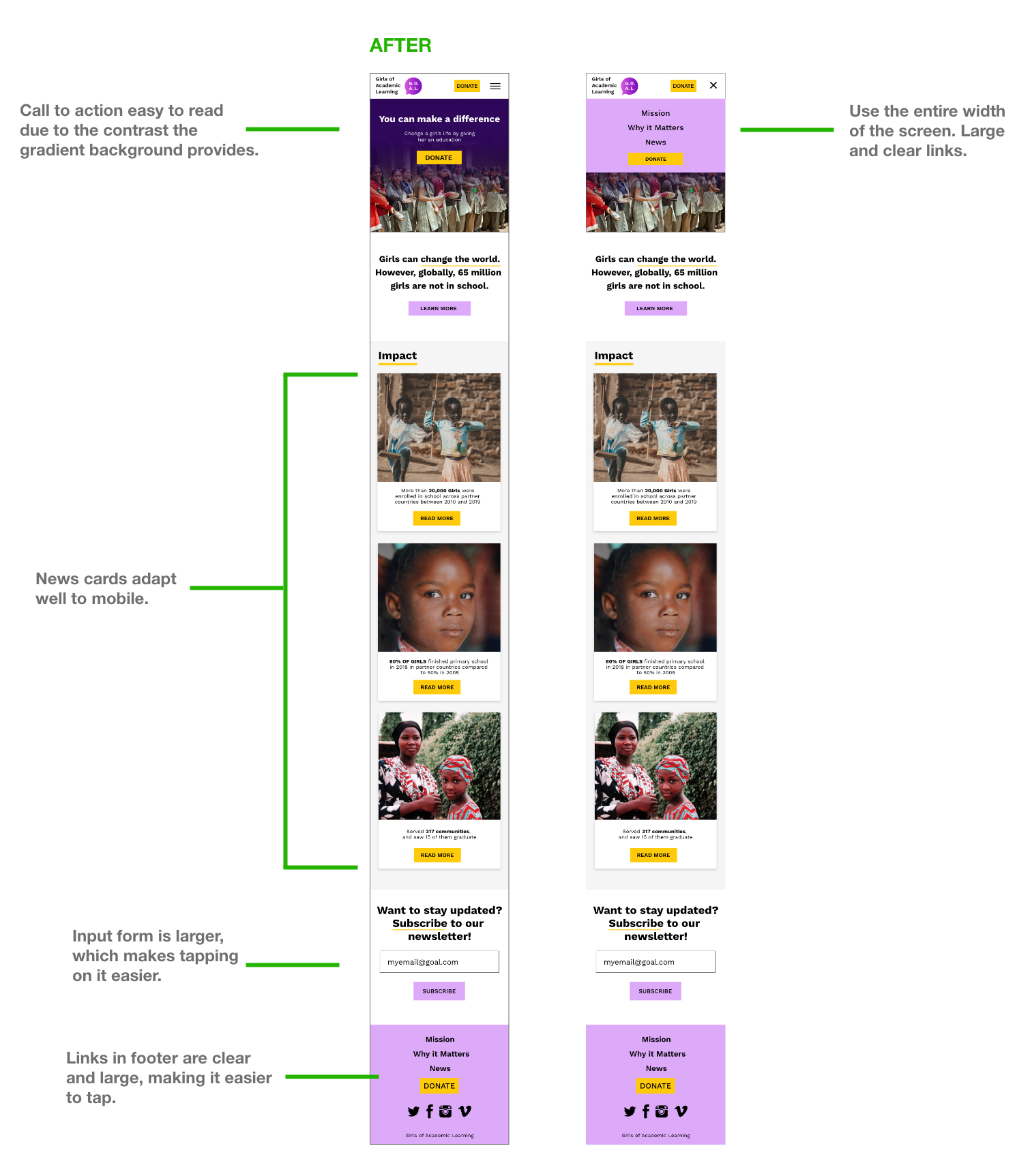
This is especially true in mobile, but the type size is way too small and gets easily lost in a lot of information.
c. Missing information when mobile
This was another big issue. Users do not like to feel like that they are missing content and information. I needed to redesign the site so it adapts better to mobile while retaining all the information in desktop.
In order to test the usability of the site, I listed some tasks for the participants to complete:
1. Someone told you about the organization and you want to find more about their mission.
2. You want to donate to the cause but also want to know how you’re contributing.
3. You want to find out where you can read relevant updates/news about the cause.
I then organized the painpoints in an affinity map.
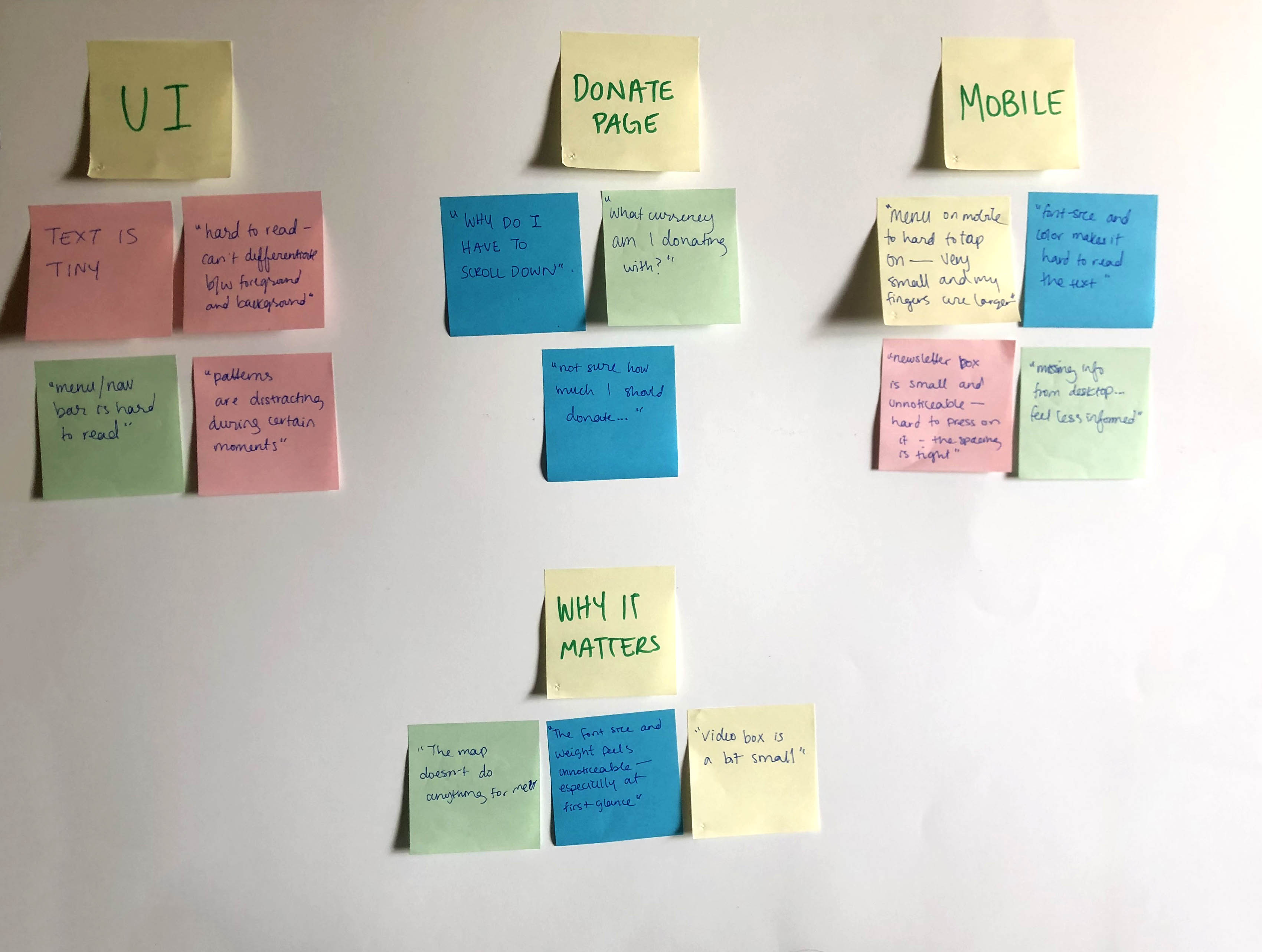
This exercise gave more clarity on the specific painpoints experienced by users. Things that came up frequently during the usability tests were:
1. Most people had a hard time reading certain texts. This was especially true in mobile.
2. Most people did not know you had to scroll down or that it was even an option.
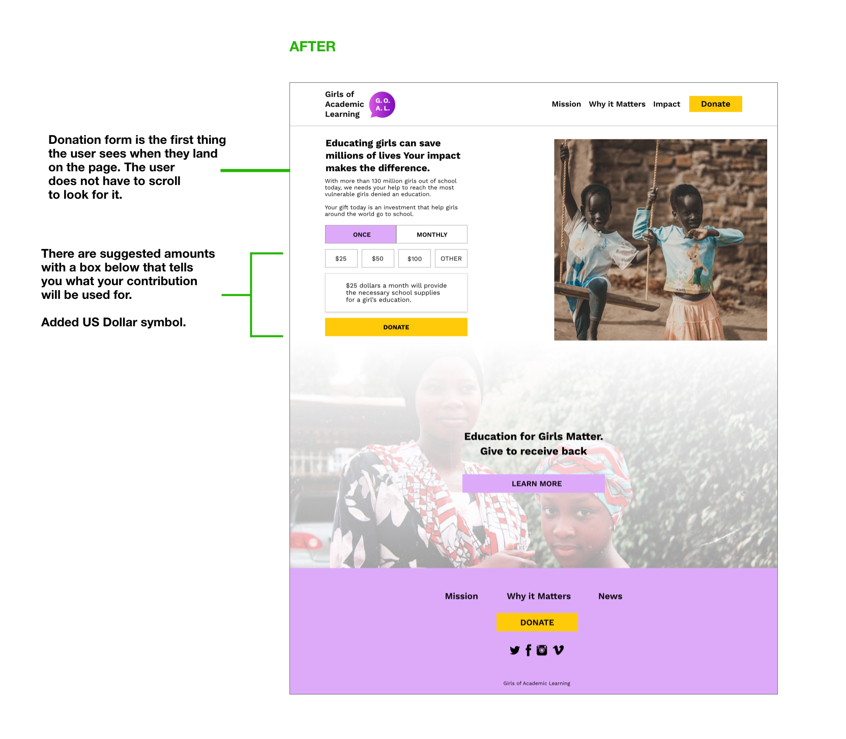
3. Users wanted to know where there money was going specifically and how they are contributing. They were also unsure of the currency of their donation.
I decided to prioritize these three pain points since they came up more frequently than others.
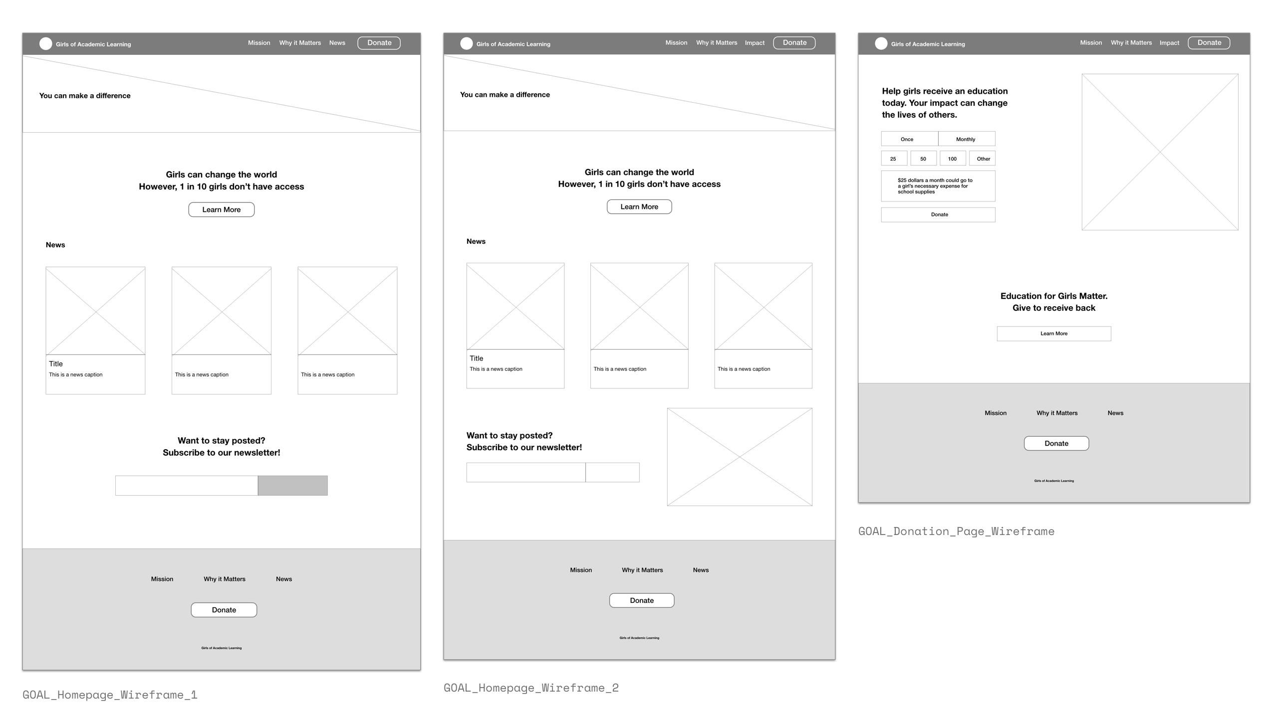
I then created mockups, showing the before and after. I annotated initial problems that were pointed out by users in the before and added notes about my design solutions in the after.

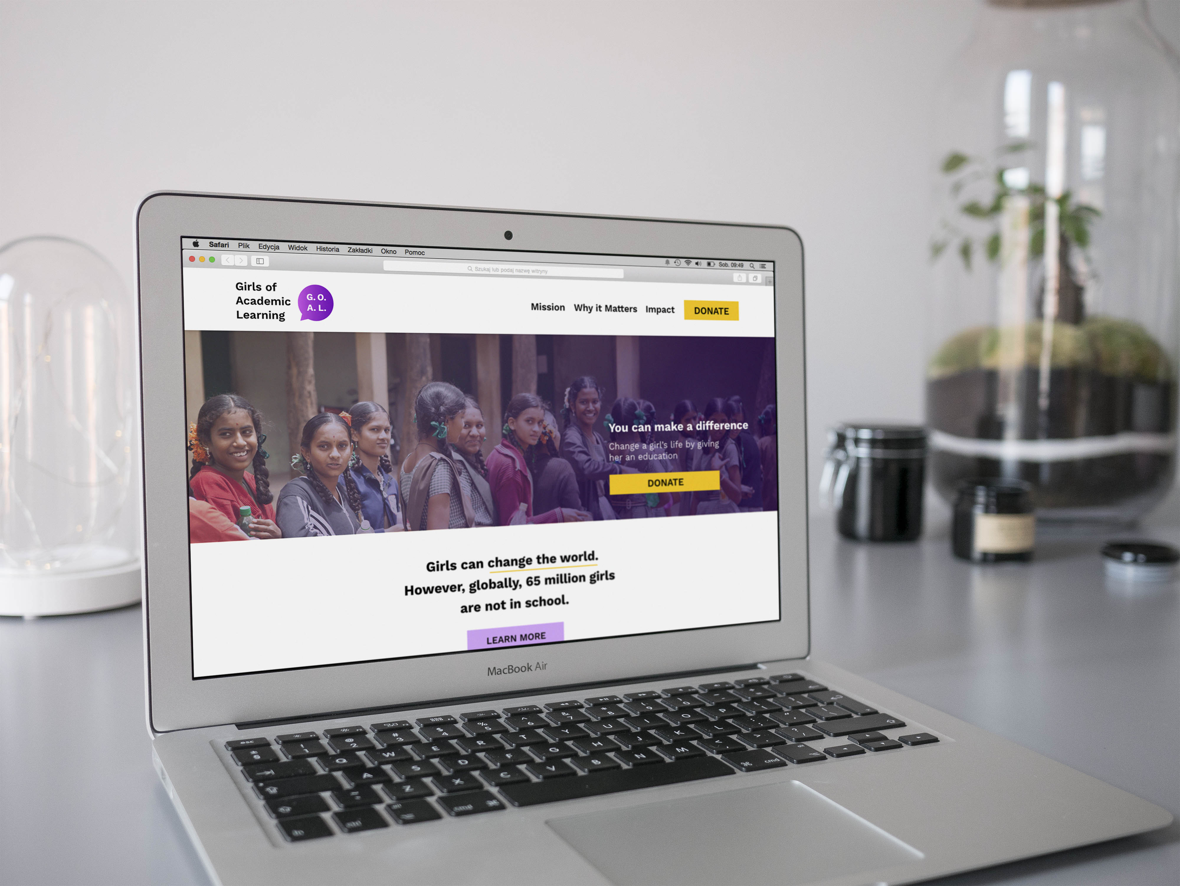
To sum things up, I focused on three pain points and designed solutions to each one.
1. Users found it hard to read the content. This was especially true in mobile.
Solution: Optimize color contrast and remove unnecessary clutter. Choose appropriate typefaces and font-sizes that will allow users to easily read the content without having to zoom in.
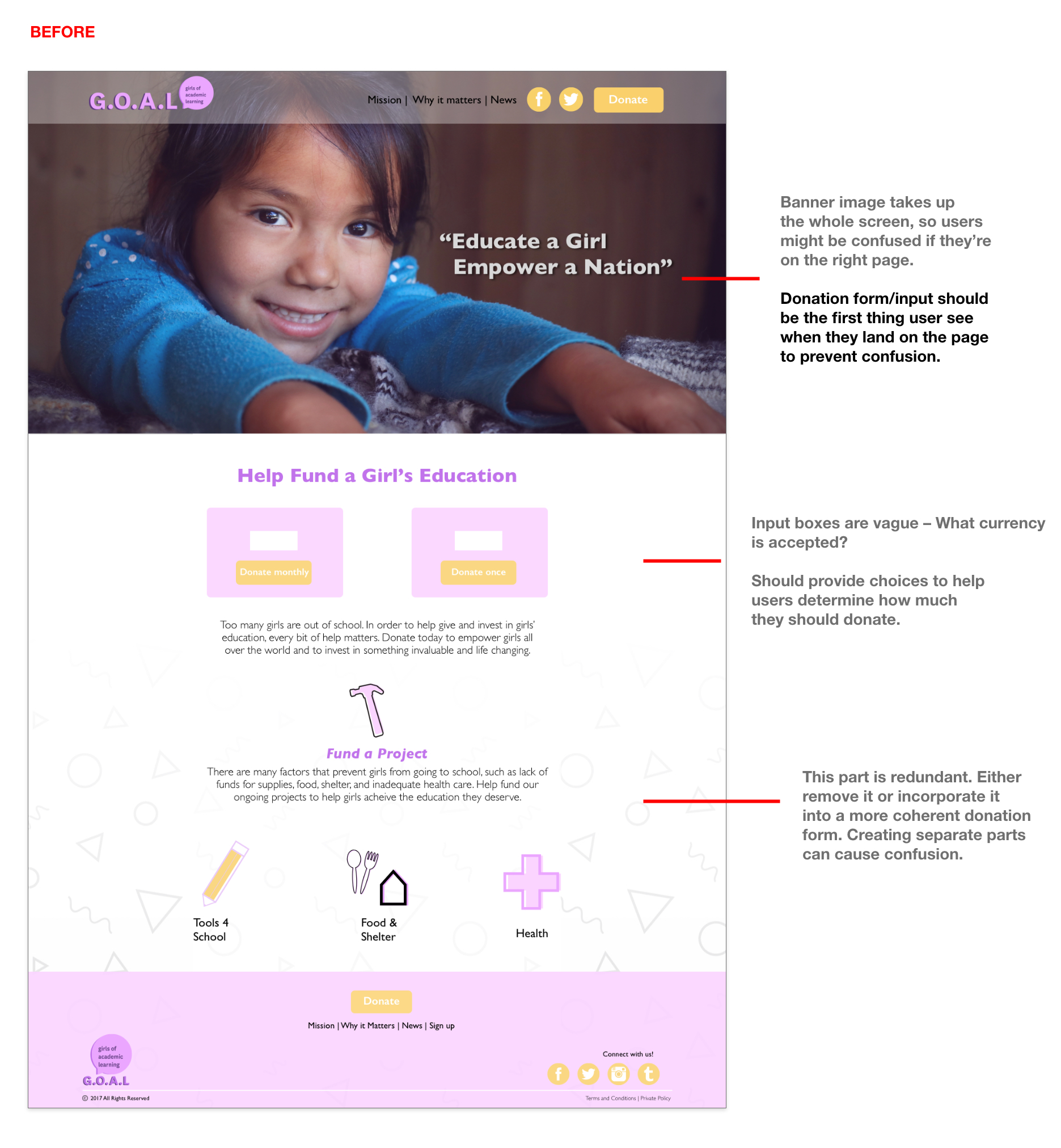
2. Most users did not know you had to scroll down on some pages, most frequently, the donation page.
Solution: Hint to users that there is important content beneat the header images. A good way to do that is to not occupy the whole screen with just static image.
3. Users wanted to know specifically where there money was going and the accepted currency.
Solution: Inform users on the currency used. In addition, I added a box that informs users how their contribution will be used.
I believe that these changes will give a more pleasurable user experience and will eliminate a lot of confusion. It was good to reflect on an earlier project and test my capabilities as a designer today.