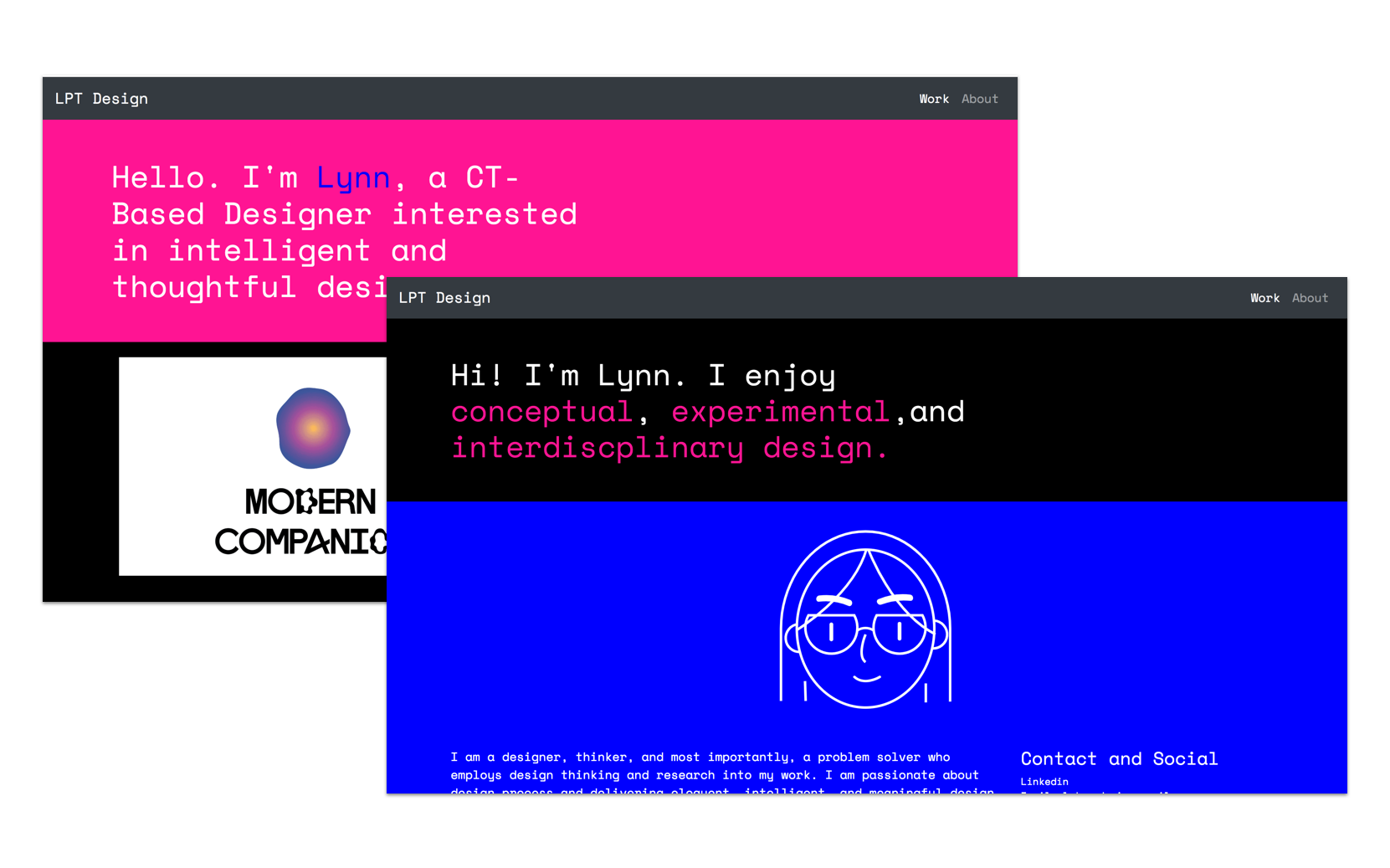

For a creative, a website is like a home. It is a place where your work lives. In the past, I have used many different platforms, such as wixsite, Tumblr, Wordpress, Adobe’s myportfolio, and more. Although these sites worked perfectly fine, I wanted to invision, create, and personalize a site tailored to my design aesthetics and build a home suited for my work. Just as I built and createdthe pieces I was going to showcase, I wanted to build the home for it too.
It was also a chance to test my web development and design skills. It was a bit out of my comfort zone, but I had a few tools assisting me.
I used Bootstrap to aid with the coding, as well as Sketch, Brackets, and Koala. I used a boilerplate template and wrote the HTML and CSS to my site.
First off, I sketched ideas I had onto paper, envisioning some possible layout and structure of the site.Something that was important was making the website responsive and user-friendly for people on different platforms. I wanted most of my projects to be visible when the user first lands on the site.
The main purpose is to present and showcase my work; I didn’t want people spending too long ot actually look for my work.
I also wanted to keep the site and structure relatively simple. As stated before, the site is to present my
work, so I didn’t want other factors of the site to detract from the content.
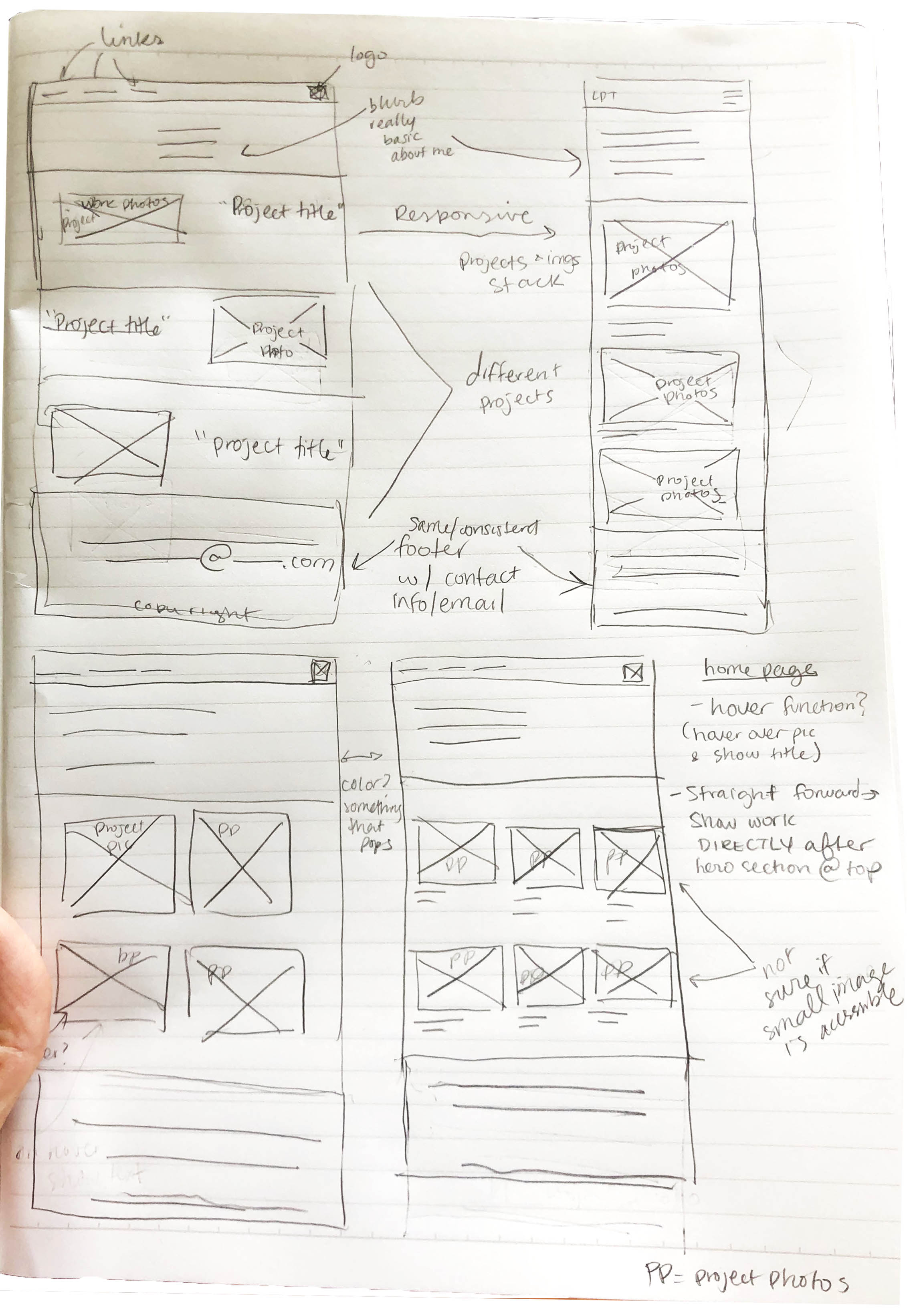
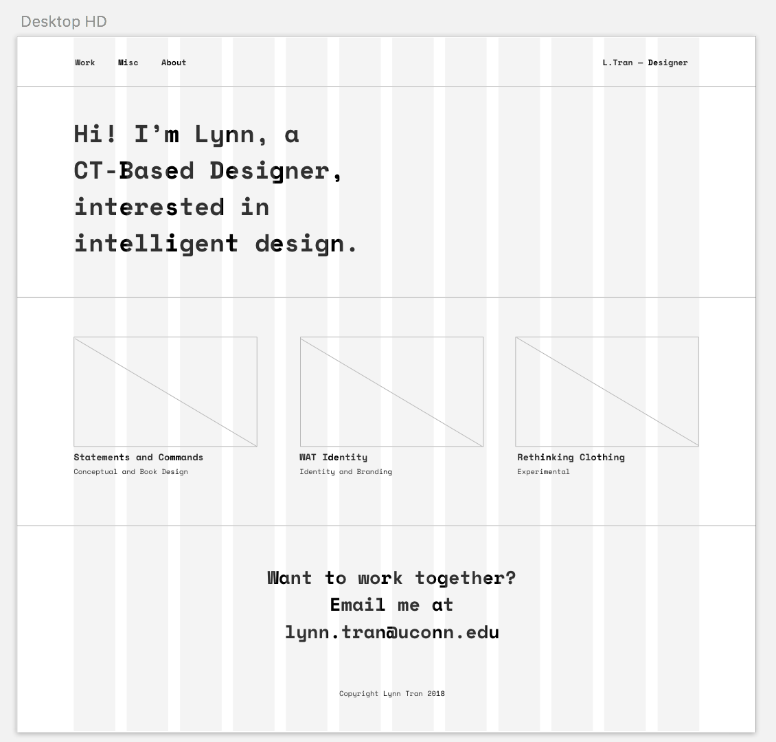
I turned to sketch when creating digital wireframes. I translated some of the ideas I had down onto page into Sketch. I knew I wanted to have a hero section with larger text that gives a bit of context to my website.
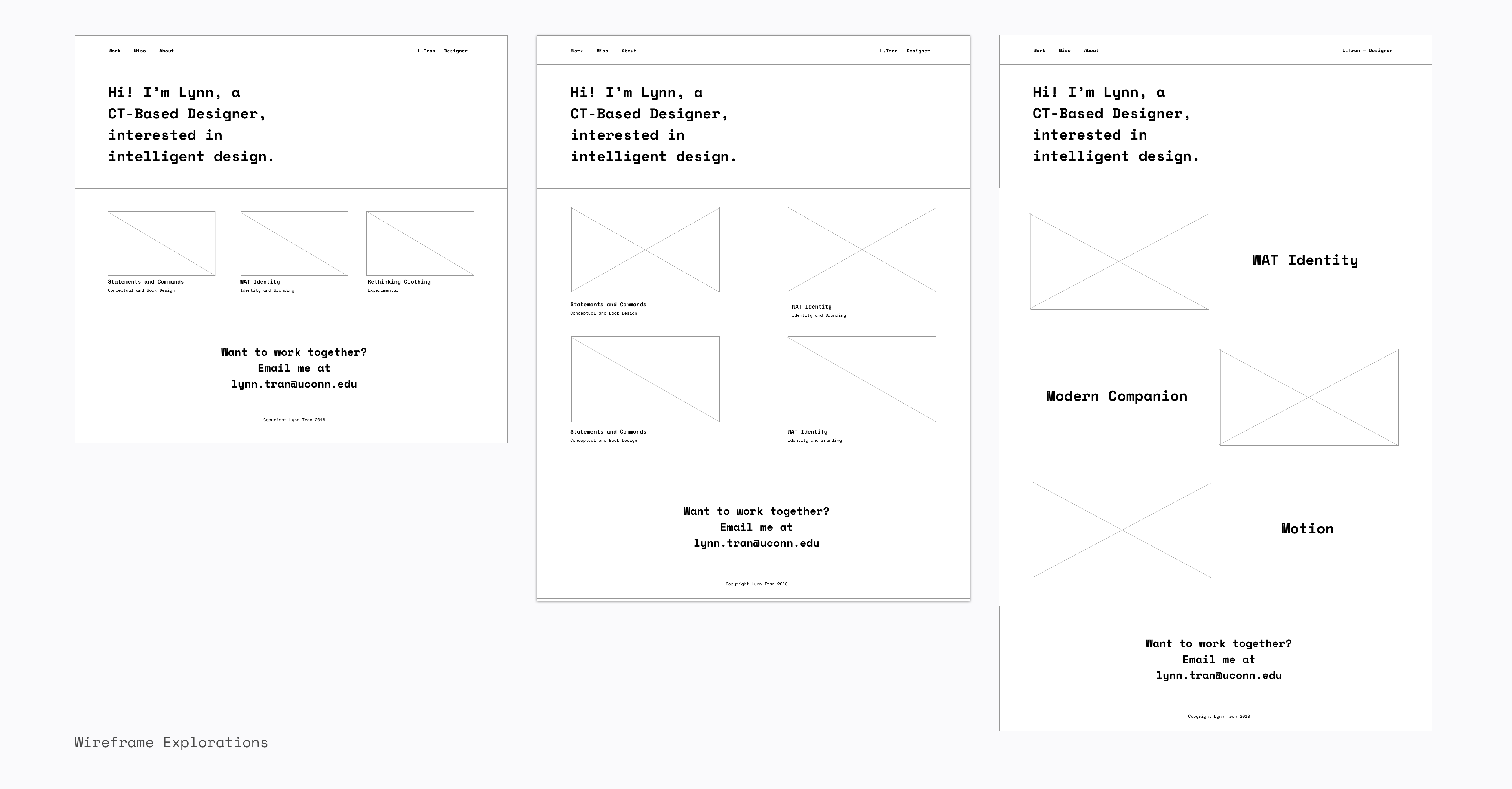
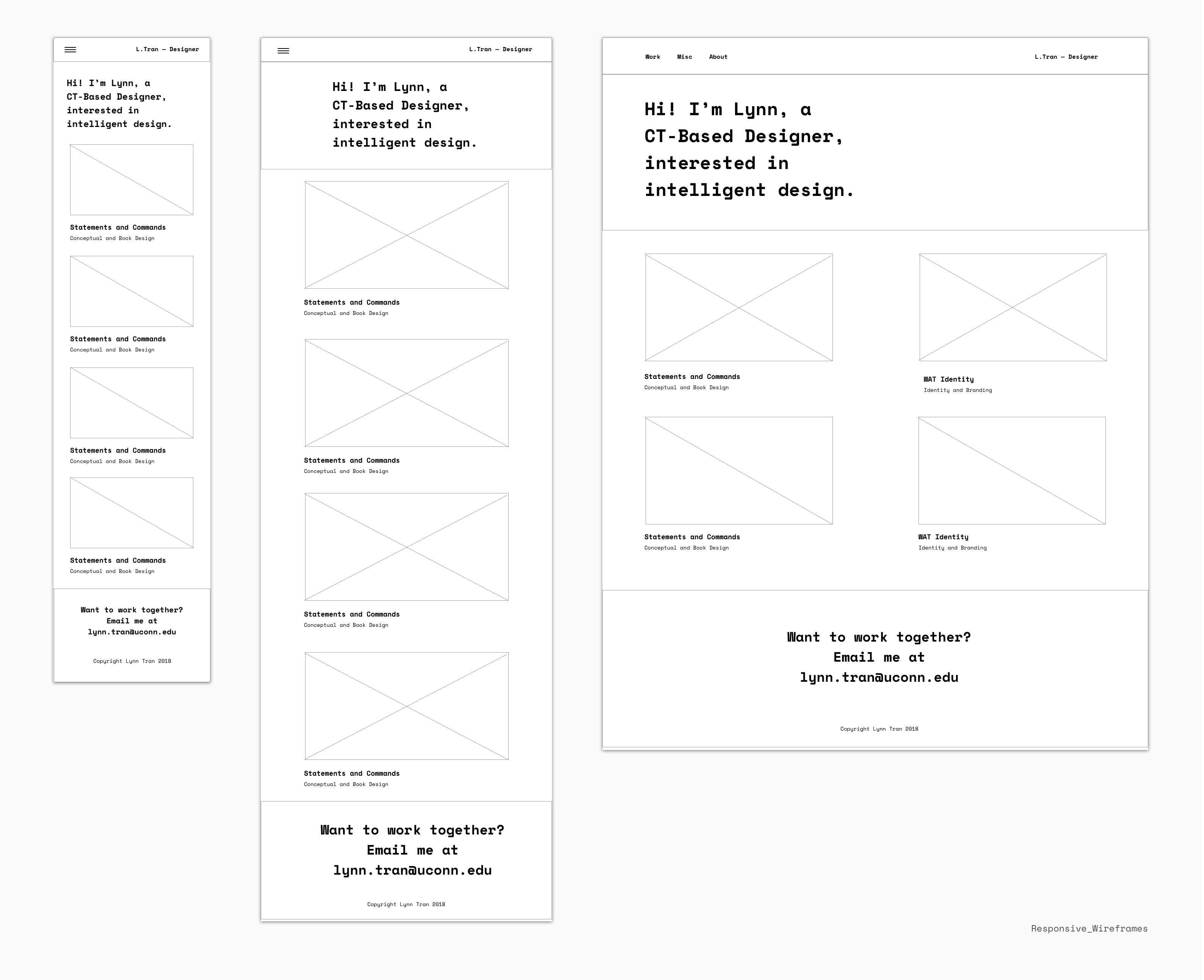
I kept in mind how I wanted things to play out in different screen sizes, how content would unfold and behave in different screen sizes. I prioritized responsive web design, wanting to make my website be accesible to mobile, iPad/Tablet, and web users. I figured for mobile, things should be stacked so images can span as wide as possible, in addition to giving more screen-space to mobile users. If it were in a column at mobile size and maybe even tablet size, users might have a hard time selecting things.
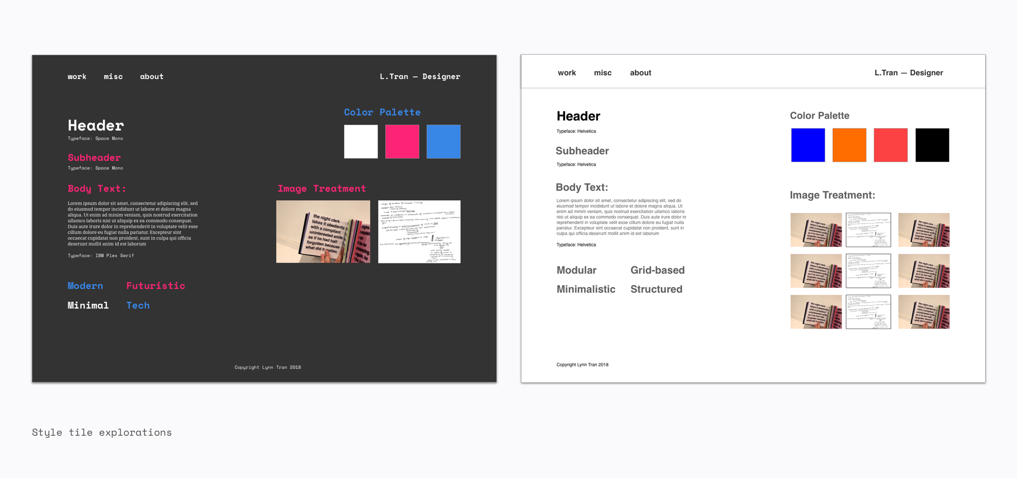
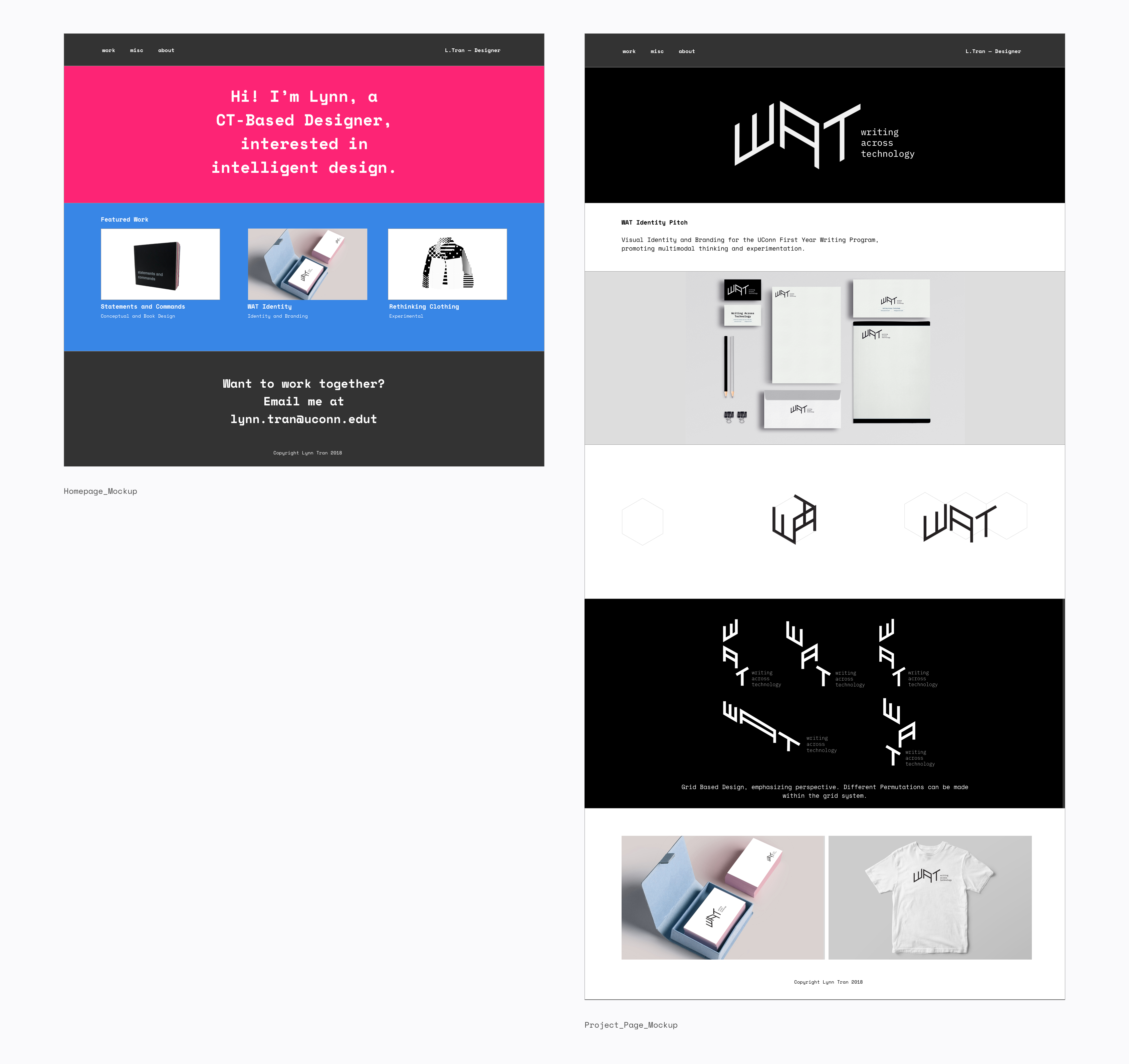
After getting a sense of what the site might look like after I did hi-fidelity mockups led me to my next step: developing it. I used Brackets to write my CSS and HTML and prototyped a lot within the browser. I ultimately made some color changes and other structural changes.
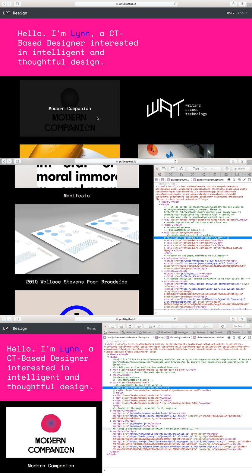
After I did the wireframes, I finetuned certain elements, such as color, and used HTML5/CSS3 to develop my webpage and prototyped constantly within the browser. For desktop, I did a hover function that gives context about the project title. However, on smaller sizes where hover is not an option, I stacked the images and made the project title visible underneath the project photo.
Ultimately, I slightly altered the colors so there would be more of a contrast. I am still working on it, as there are many things I still want to add. However, I was able to put responsive web into action, making my website accesible to those on different platforms.
Even after publishing my website, I found more things I could impove upon and am continuously modifying and optimizing my site for the best user experience. Elements I want to include are:
1. Providing ways to view another project
2. A possible blog section to my website
3. Finetuning typography
I am pleased that I went through with designing and coding my own website, as I can now easily customize it. I enjoyed the learning curves and the realization of how some things weren’t as daunting as I initially thought. It was a good out of comfort zone project with still some familiarity in terms of design and HTML/CSS.